Initial Contact & The Brief
Established in 2002, LAM Welding Engineering Services discovered me through Facebook. On the hunt for a new logo, business cards, email domain and a website, Katy contacted me through email. We started with Katy relaying to me the ideas of what that LAM logo would look like. After putting down her pencil and leaving her short-lived art career behind, Katy gave me the brief to stick to as below:
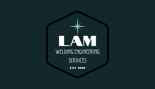
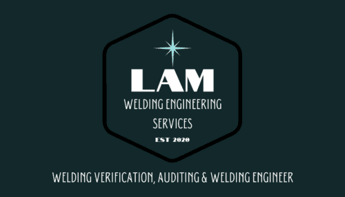
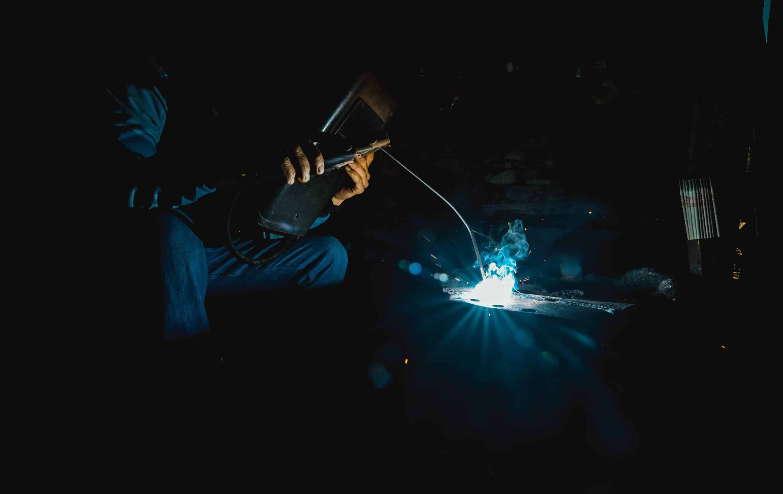
A spark (it’s a welding company)
LAM Welding Engineering services – company name
Maybe an est 2020 somewhere
So, where do you start in creating a logo?
Most, if not all designs, regardless of whether the design is a logo, an infographic, business cards, a website, an email campaign or a social media campaign are primary ideas. I want it to look like *this*. My work gets the idea out of a head and down on paper or a blank canvas.
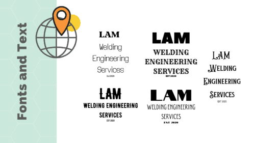
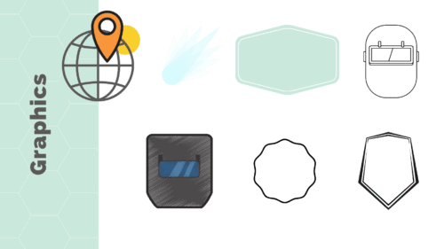
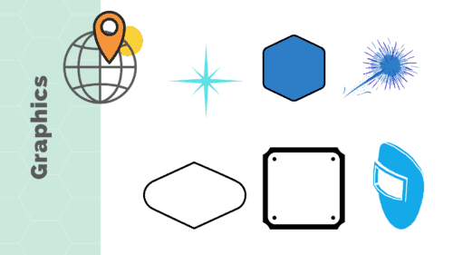
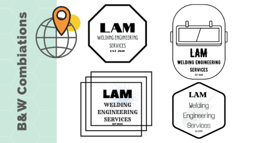
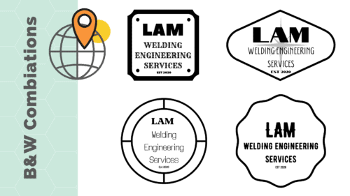
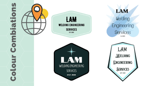
From Katy’s ideas, I cherry-picked a few ideas of my own. The first thought was around colour and graphics, which was ‘electric blue and white colours, similar to that of a welding spark’. Added thought was to have ‘a mixture of sparks, welding masks and/or a shaped badge’. I was also thinking ‘strong fonts, the bolder the better, but not overcomplicated and readable’. Below are the initial proposals that I sent to LAM.

Decision Time
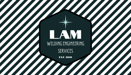
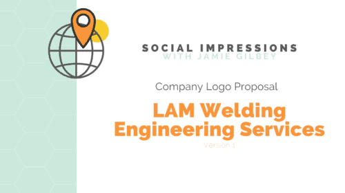
From the proposed designs, LAM Welding Engineering Services chose the design below as their logo. At this point, we finalise the email domain giving LAM a professional email domain.
![]()
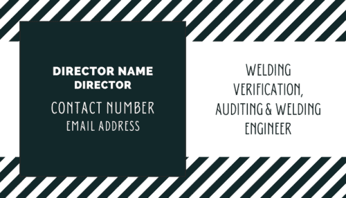
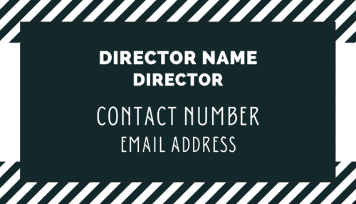
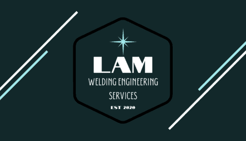
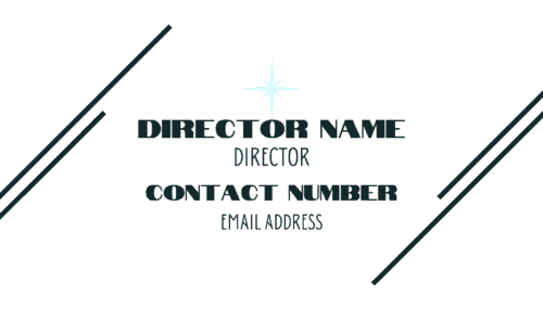
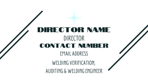
Logo complete, now for Business Cards